
Introdução
Quando se trata de apresentação do PowerPoint, os gráficos são bastante importantes, não é mesmo? Gráficos podem visualizar uma grande quantidade de dados complexos, o que é útil para comparação e análise de dados. Este artigo enfoca a forma de criar os tipos de gráficos mais utilizados (incluindo gráfico de colunas, gráfico de torta e gráfico de combinação) usando . NET Presentation Library em suas aplicações C #.
Antes de começar, você precisa baixar a biblioteca do link fornecido ou adicionar via nuget, adicionar os arquivos DLL como referências em seu projeto e importar os seguintes espaços de nome necessários no início.
using System;
using Spire.Presentation;
using System.Drawing;
using Spire.Presentation.Charts;
using System.Data;
using Spire.Presentation.Drawing;
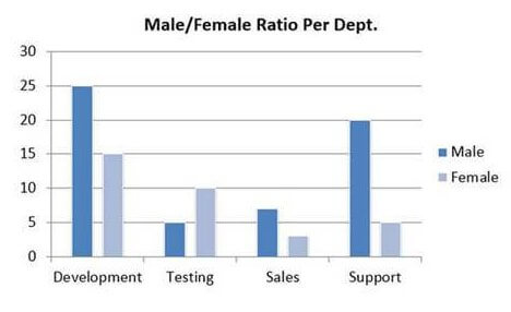
Como criar um gráfico de colunas
Um gráfico de colunas exibe uma série como um conjunto de barras verticais que são agrupadas por categoria, o seguinte gráfico ficaria desta forma:
Veja o código fonte do mesmo:
    //create a PowerPoint document
    Presentation presentation = new Presentation();

    //insert a column chart
    RectangleF rect = new RectangleF(40, 100, 550, 320);
    IChart chart = presentation.Slides[0].Shapes.AppendChart(ChartType.ColumnClustered, rect);

    //set title
    chart.ChartTitle.TextProperties.Text = "Male/Female Ratio Per Dept.";
    chart.ChartTitle.TextProperties.IsCentered = true;
    chart.ChartTitle.Height = 30;
    chart.HasTitle = true;

    //define a multi-dimensional array of strings
    string[,] data = new string[,]
    {
      {"Department","Male","Female" },
      {"Development","25","15"},
      {"Testing","5","10" },
      {"Sales","7","3" },
      {"Support","20","5" }
    };

    //write data to chart data
    for (int i = 0; i < data.GetLength(0); i++)
    {
        for (int j = 0; j < data.GetLength(1); j++)
        {
            int number;
            bool result = Int32.TryParse(data[i, j], out number);
            if (result)
            {
                chart.ChartData[i, j].Value = number;
            }
            else
            {
                chart.ChartData[i, j].Value = data[i, j];
            }
        }
    }

    //set series labels
    chart.Series.SeriesLabel = chart.ChartData["B1", "C1"];

    //set category labels
    chart.Categories.CategoryLabels = chart.ChartData["A2", "A5"];

    //set the series values
    chart.Series[0].Values = chart.ChartData["B2", "B5"];
    chart.Series[1].Values = chart.ChartData["C2", "C5"];

    //apply built-in chart style
    chart.ChartStyle = ChartStyle.Style11;

    //set overlap
    chart.OverLap = -50;

    //set gap width
    chart.GapWidth = 200;

    //save to file
    presentation.SaveToFile("ColumnChart.pptx", FileFormat.Pptx2010);
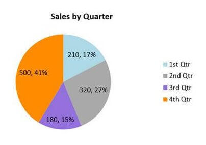
Como criar um gráfico de pizza
Um gráfico de torta ajuda a mostrar as proporções e porcentagens entre as categorias, dividindo um círculo em segmentos proporcionais, veja a imagem gerada:
Veja o código fonte:
     //create a PowerPoint document
    Presentation ppt = new Presentation();

    //insert a pie chart
    RectangleF rect1 = new RectangleF(40, 100, 550, 320);
    IChart chart = ppt.Slides[0].Shapes.AppendChart(ChartType.Pie, rect1, false);

    //set title
    chart.ChartTitle.TextProperties.Text = "Sales by Quarter";
    chart.ChartTitle.TextProperties.IsCentered = true;
    chart.ChartTitle.Height = 30;
    chart.HasTitle = true;

    //define sample data and assign the data to chart data
    string[] quarters = new string[] { "1st Qtr", "2nd Qtr", "3rd Qtr", "4th Qtr" };
    int[] sales = new int[] { 210, 320, 180, 500 };
    chart.ChartData[0, 0].Text = "Quarters";
    chart.ChartData[0, 1].Text = "Sales";
    for (int i = 0; i < quarters.Length; ++i)
    {
        chart.ChartData[i + 1, 0].Value = quarters[i];
        chart.ChartData[i + 1, 1].Value = sales[i];
    }

    //set series label
    chart.Series.SeriesLabel = chart.ChartData["B1", "B1"];

    //set category labels
    chart.Categories.CategoryLabels = chart.ChartData["A2", "A5"];

    //set series values
    chart.Series[0].Values = chart.ChartData["B2", "B5"];

    //ddd data points to series and fill each data point with different color
    for (int i = 0; i < chart.Series[0].Values.Count; i++)
    {
        ChartDataPoint cdp = new ChartDataPoint(chart.Series[0]);
        cdp.Index = i;
        chart.Series[0].DataPoints.Add(cdp);

    }
    chart.Series[0].DataPoints[0].Fill.FillType = FillFormatType.Solid;
    chart.Series[0].DataPoints[0].Fill.SolidColor.Color = Color.LightBlue;
    chart.Series[0].DataPoints[1].Fill.FillType = FillFormatType.Solid;
    chart.Series[0].DataPoints[1].Fill.SolidColor.Color = Color.DarkGray;
    chart.Series[0].DataPoints[2].Fill.FillType = FillFormatType.Solid;
    chart.Series[0].DataPoints[2].Fill.SolidColor.Color = Color.MediumPurple;
    chart.Series[0].DataPoints[3].Fill.FillType = FillFormatType.Solid;
    chart.Series[0].DataPoints[3].Fill.SolidColor.Color = Color.DarkOrange;

    //set labels to display label value and percentage value.
    chart.Series[0].DataLabels.LabelValueVisible = true;
    chart.Series[0].DataLabels.PercentValueVisible = true;

    //save to file
    ppt.SaveToFile("PieChart.pptx", FileFormat.Pptx2010);
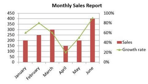
Como criar um gráfico de combinação
Um gráfico de combinação é um gráfico que combina dois ou mais tipos de gráfico em um único gráfico, neste caso barra e linha:
Veja o código fonte do gráfico:
     //create a PowerPoint document
    Presentation presentation = new Presentation();

    //insert a column chart
    RectangleF rect = new RectangleF(40, 100, 550, 320);
    IChart chart = presentation.Slides[0].Shapes.AppendChart(ChartType.ColumnClustered, rect);

    //set chart title
    chart.ChartTitle.TextProperties.Text = "Monthly Sales Report";
    chart.ChartTitle.TextProperties.IsCentered = true;
    chart.ChartTitle.Height = 30;
    chart.HasTitle = true;

    //create a datatable
    DataTable dataTable = new DataTable();
    dataTable.Columns.Add(new DataColumn("Month", Type.GetType("System.String")));
    dataTable.Columns.Add(new DataColumn("Sales", Type.GetType("System.Int32")));
    dataTable.Columns.Add(new DataColumn("Growth rate", Type.GetType("System.Decimal")));
    dataTable.Rows.Add("January", 200, 0.6);
    dataTable.Rows.Add("February", 250, 0.8);
    dataTable.Rows.Add("March", 300, 0.6);
    dataTable.Rows.Add("April", 150, 0.2);
    dataTable.Rows.Add("May", 200, 0.5);
    dataTable.Rows.Add("June", 400, 0.9);

    //import data from datatable to chart data
    for (int c = 0; c < dataTable.Columns.Count; c++)
    {
        chart.ChartData[0, c].Text = dataTable.Columns[c].Caption;
    }
    for (int r = 0; r < dataTable.Rows.Count; r++)
    {
        object[] datas = dataTable.Rows[r].ItemArray;
        for (int c = 0; c < datas.Length; c++)
        {
            chart.ChartData[r + 1, c].Value = datas[c];

        }
    }

    //set series labels
    chart.Series.SeriesLabel = chart.ChartData["B1", "C1"];

    //set categories labels
    chart.Categories.CategoryLabels = chart.ChartData["A2", "A7"];

    //assign data to series values
    chart.Series[0].Values = chart.ChartData["B2", "B7"];
    chart.Series[1].Values = chart.ChartData["C2", "C7"];

    //change the chart type of series 2 to line chart with markers
    chart.Series[1].Type = ChartType.LineMarkers;

    //plot data of series 2 on the secondary axis
    chart.Series[1].UseSecondAxis = true;

    //set the number format as percentage
    chart.SecondaryValueAxis.NumberFormat = "0%";

    //hide grid lines of secondary axis
    chart.SecondaryValueAxis.MajorGridTextLines.FillType = FillFormatType.None;

    //set overlap
    chart.OverLap = -50;

    //set gap width
    chart.GapWidth = 200;

    //save to file
    presentation.SaveToFile("CombinationChart.pptx", FileFormat.Pptx2010);
Espero que tenham gostado do tutorial de hoje! Um grande abraço 🙂